Sunday, 28 March 2021

Children


1964: Child Welfare (Design - RDE 'Ootje' Oxenaar)

A young artist gets to work with his paintbrush

Meanwhile down the corridor a girl is playing a recorder
while toy-making is in progress at the work shop. 
2002: Astrid Lindgren 1907-2002

Well away from school these children are having adventures while Astrid Lindgren looks benignly on. Starting from the top left and going clockwise we have - Pippi Longstocking; Karlsson on the Roof; Emil of Lonneberga, Madicken,  Lotta on Troublemaker Street and lastly The Brothers Lionheart 

Weirdly before I had chosen my stamps for this week I read how the Astrid Lindgren Memorial Award graphics had been redesigned, the result was inspired by her stories and her shorthand notebooks. I knew nothing about her unique shorthand, of which little has been deciphered. There is now a Swedish project called the Astrid Lindgren Code to decode the manuscripts.  The Design Week article is here

Sunday Stamps II theme this week is - Children - go play at See It On A Postcard

Sunday, 21 March 2021

The Deep Blue Sea


2010: Marine Life (Design - |Martin Mörck; Engraver - Top L Sjööblom; Bottom M Mörck)

Swimming though the deep blue sea is a Harbour Porpoise and a very cute Sea Otter.  Then totally on theme there is a Blue Whale which looks grey on the surface but when they dive the light from the sun and the colour of the water make them look deep blue. (10 big blue whale facts here) and lastly in size contrast the small  Ringed Seal.  This was a Swedish and Canada joint issue.  I don't have the Canadian stamps but

1968: Wild Life (Design - John Alexander Crosby)

I do have a magnificent narwhal with its tusk of 10 million nerve endings - the unicorn of the sea.

1967: Fish

Swordfish always look rather grumpy perhaps because they have bills rather than a tusk like the Narwhal.  But now I go small

1968: Sea Fauna

and another blue creature, the Common Lobster, blue above and yellowish below with those formidable pincers. Lobster claws change and grow throughout their lives. The large claw is called the crusher and the smaller claw the pincer or cutter. Like us they can be left or right handed, if that is the right word.

2010: Marine Life Booklet Cover


Sunday Stamps II theme - The Deep Blue Sea - dive in at See It On A Postcard


Wednesday, 17 March 2021

Cheers


The sheep enjoying their Guinness on St Patrick's Day. Sláinte Ireland enjoy your day.

Sunday, 14 March 2021

Lettering


1998: |History of the Letter
Lot of fonts on this stamp, I count five, as Pheidippides sets off on his run from the Battle of Marathon to Athens.  It is all downhill from here
1992: 350th Anniversary of the Civil War (Design - Jeremy Sancha)

and another battle, or in this case a lot of them in the English Civil War

Why the little squiggly things at the end?  I don't know the significance perhaps it is to make the text a block although at the back of my mind I seem to remember that in the past there were no punctuation marks, as we know them today, to divide sentences.  No mention of them in an article about the stamp design here.
1930: International Colonial Exposition, Paris (Design Louis Regal; Engraver Abel Mignon)

I love the art deco vibe in these French stamps and indeed it is a style associated with the art of Louis Regal, artist, sculptor and mosaicist.

1935: German Rail Centenary (Design - Karl Diebitsche)

I also like a Blackletter or Gothic typeface (in this case Fraktur) and here it comes with the Flying Hamburger, Germany's first fast diesel train (the fastest railway connection in the world in 1935).

1947-48 Definitive (Design - Hopfner)

A pared down blackletter issued by the Allied Occupation in Germany showing an allegory of Germany reaching for Peace (there were 21 definitives).  In theory all the zones had to use the same stamps after 1945, which was generally true apart from the French zone which liked to produce its own issues.  The postmark of Demmin  is in North East Germany which was the Soviet Zone (Postal District 37/38).

Gill Sans

Sunday Stamps II theme this week is - Fonts and Typefaces - read more at See It On A Postcard  

Sunday, 7 March 2021

World Heritage Sites

2001: National Parks (Design - Studio Mean)

I'll start off in my home county with a view of the English Lake District which was recently awarded a UNESCO designation in 2017.  The lake is Crummock Water and a larger aerial view can be seen here.  There is nice low level walk around the lake and its companion Buttermere, perfect in summer  when one can picnic at the half way point or take a trip into the Fish Inn.  Some stamp collecting wags have called the National Park series of stamps the National Car Park set.

2020: Roman Britain (Design - Up)

Head for the wild frontier and  Hadrian's Wall, or what remains of the 84 miles of wall and forts across the country built in an attempt to keep out the Picts and Scots.  There is still lots to see.  I wonder what those Roman soldiers thought in the middle of winter up here, probably wishing they were home by the warm Mediterranean so lets grant them their wish and sail into

2015: Sea Travel (Design - Andy Tuohy)

Venice although this city came of age in the maritime era and in Roman times was just a marshy lagoon inhabited by fishermen.

1961: Tourist Publicity

Travel on to Greece and the magnificently situated Delphi We would all probably welcome someone like the Delphic Oracle to divine the future at the moment, or maybe not depending what is in store.

2008: World Heritage Sites

A satisfyingly large stamp from South Africa showing a mountain ridge in the dramatic Drakensberg Park..


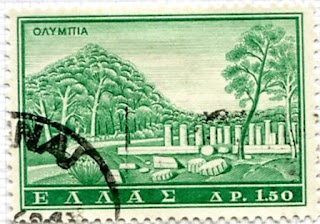
1961: Tourist Publicity - Olympia


Sunday Stamps theme this week is World Heritage Sites - travel to See It On A Postcard


Thursday, 4 March 2021

World Book Day

For World Book Day I take a trip to Hundred Acre Wood to visit Winnie the Pooh and there is a map to guide me in handy postcard form, this is where Christopher Robin and his friends lived and had many adventures. The map is centered on Owls House but not all the places in the  'Winnie the Pooh'  book are on the map as they come and go out of the wood. AA Milne's 100 Acre Wood is based on a  much bigger beach wood called 500 Acre Wood in the Ashdown Forest in southern England.

“When you wake up in the morning, Pooh,” said Piglet at last, “what’s the first thing you say to yourself?” “What’s for breakfast,” said Pooh. “What do you say, Piglet?” “I say, I wonder what’s going to happen exciting today?” said Piglet. Pooh nodded thoughtfully. “It’s the same thing,” he said.” - A.A. Milne, Winnie the Pooh